Landing Page: Conversion Optimization in 7 Steps
Your event is ready. The agenda is locked in. Your speakers are confirmed, whether you’re running a B2B webinar, a leadership offsite, a customer conference, or an internal training session. There’s just one thing left to do: convince your prospects, employees, or learners to actually sign up.
And that’s where everything gets decided. An event landing page isn’t a box to check, it’s the first handshake between your event and your audience. It’s the moment a prospect decides, in a matter of seconds, whether your event is worth their time, their calendar, and their energy. On desktop between two emails, on mobile during a commute, from a link shared on LinkedIn or an invite sitting in their inbox, the decision is fast, sometimes gut-driven, and always shaped by the same handful of factors.
👉 Here are the 7 decisions that separate a page that fills up your event from one nobody finishes.
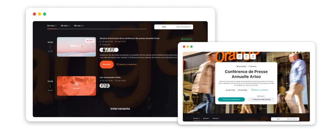
A well-built event landing page is your first lever for conversion.
A headline that spells out exactly what attendees get
The headline on your registration page is the first thing prospects, delegates, or would-be learners read and often the only thing that decides whether they keep reading.
A strong event headline doesn’t describe the format. It sells the payoff of showing up.
- For an HR webinar, “HR Turnover Webinar” versus “How to Cut Employee Turnover by 30% in 6 Months: The HR Playbook That Actually Works” the difference is night and day.
- For a customer conference, “2026 Annual Conference” versus “5 Innovations About to Reshape Your Market in the Next 18 Months.”
- For an internal management training, “Management Training” versus “Become the Manager Your Team Has Been Waiting For, in One Day.”
⭐️ The golden rule: a headline that converts answers your audience’s unspoken question, “What’s in it for me?”, before they even ask it.
- Benefit-first, never descriptive or generic
- Specific: a number, a concrete promise, a measurable outcome
- Short and scannable: one line, even on a phone screen
- Matched to what your audience actually wants, not just what you want to say
2. A hero image that puts the visitor inside the event
The visual is the second thing people notice, often before they even read the headline. And yet it’s the most overlooked piece of an event registration page. It plays a major role in the sign-up decision, especially for in-person events and community-driven conferences.
The strongest move: a real photo from your last edition. A packed room, a candid networking moment, a well-framed shot of the stage: these instantly pull visitors into the atmosphere and make them want in. That’s true for a residential seminar just as much as an annual convention.
For an online webinar or masterclass, a headshot of the speaker beats any other visual. People sign up for a person as much as a topic. Name, title, company: three details that build more trust and credibility than a polished graphic background ever will.
Either way, your page’s visual identity needs to stay consistent with your brand. A registration page that looks like you builds more trust than a generic template, no matter the type of event.
What works:
- Photos from the last edition: authenticity beats polish
- Speaker headshots: attendees connect with speakers as much as topics, especially for masterclasses
- Venue shots: for in-person events, the setting is as compelling as the agenda
- On-brand visual identity: the page should look like your company, not a stock template
3. A short, targeted registration form built for the format
The registration form is the tipping point between intent and action. Every extra field adds friction, slows down momentum, and quietly chips away at your conversion rate.
Needs vary by event type. A remote B2B webinar doesn’t call for the same fields as a two-day residential seminar. For the former, three fields usually do the job: first name, work email, company. That’s enough to qualify the registrant and send them their access link. For the latter, dietary preferences and travel details come in naturally. A multi-track conference might need a track-selection field to help delegates plan their day on-site. An internal training benefits from knowing someone’s department or team so groups can be organized ahead of time.
The question to ask for every single field: “Do I actually need this before the event happens?” If the answer is no, collect it later, in a follow-up email, a secondary form, or at check-in.
With Wisembly, build your registration form with drag-and-drop simplicity, including conditional fields that only appear based on the registrant’s profile. Build your form in under 10 minutes.
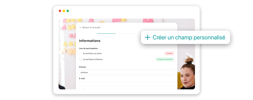
An adaptive registration form that changes based on who’s signing up.
4. A CTA button that’s visible, clear, and written in the first person
The registration button is the pivot point of your conversion page. Its visibility, color, and wording directly affect your final sign-up rate, and yet it’s often the element that gets the least attention when building the page.
“Register” is the most common label on event registration pages. It’s also one of the least compelling, because it reads like paperwork, not an experience. The label works better when it’s tailored to the type of event and to what the attendee or learner actually gets by clicking.
Label examples:
- Webinar: “Save My Spot” or “Sign Me Up for Free”
- Seminar: “Confirm My Attendance” or “Reserve My Seat”
- Conference: “Get My Badge” or “See the Full Agenda”
- Training: “Enroll Me in the Next Session” or “Join This Training”
Rules for a registration button that converts:
- Visible without scrolling: placed above the fold as soon as the page loads
- High-contrast color: it should stand out instantly against the background
- First-person wording: “I” creates a sense of commitment that “Register” doesn’t
- Repeated at the bottom of the page: for visitors who read everything before deciding
5. The essentials, prioritized and free of clutter
An event registration page isn’t a full agenda. Your visitors, whether they’re prospective delegates, targeted learners, or invited employees, need to answer three core questions before signing up, and they need to do it in under 30 seconds: What? When? For whom?
A two-day seminar deserves a “See Full Program” link pointing to a dedicated page. Cramming everything onto the conversion page just dilutes the message and buries what matters. A 45-minute webinar, on the other hand, boils down to three well-written bullet points: that’s really all a prospective listener needs to make up their mind.
Running one event or several, and looking to streamline how people sign up? Build your event page in minutes with Wisembly.
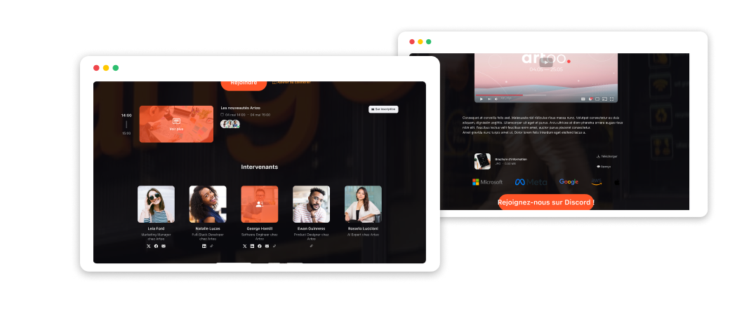
The anatomy of a well-optimized event registration page.
6. Trust signals that win over the undecided
A visitor on the fence about registering usually has a few unspoken objections: “Is this really worth my time?” “Is this actually meant for someone like me?” “What if I sign up and then can’t make it?”
These hesitations stay silent, but they still drive the decision. Trust signals answer them before they’re even asked, and that’s what turns undecided visitors into confirmed registrants.
The right signals depend on the type of event. A recurring webinar benefits from showing its numbers: “2,300 attendees at past sessions” or “97% satisfaction rate” speak louder than any description. An in-person seminar draws its strength from real testimonials by past attendees, complete with first name, title, and company. An annual conference or trade show leans on its track record: number of past editions, past speakers, press coverage. A training program or masterclass highlights concrete outcomes for past learners: skills gained, completion rates, certifications earned.
Two universal elements to always include:
- A clear cancellation or rescheduling policy: it removes a major point of hesitation, especially for paid events or ones that require travel
- Access to the replay: letting people know a recording will be available afterward unlocks sign-ups from anyone unsure they’ll be free on the day
7. A page that’s fast, mobile-friendly, and accessible anywhere
In 2026, a significant share of sign-ups for professional events, webinars, seminars, conferences, or training sessions, start on a mobile device. A link shared on LinkedIn opens on a phone. An email invite gets read on the go. A QR code at the entrance to a conference gets scanned with a smartphone. In every one of these cases, if the conversion page doesn’t render well, the visitor just leaves, and you’ll never even know it happened.
This holds true across every format and every audience: conference delegates, learners in training, employees invited to an internal seminar, listeners tuning into a B2B webinar. They all check your communications on mobile before finishing their registration, if they don’t complete it from their phone entirely.
Mobile checkpoints to run through before you publish:
- Is the registration form easy to fill out on a phone? Fields wide enough, keyboard type appropriate?
- Is the registration button immediately visible and tappable without zooming or scrolling sideways?
- Do images load in under 3 seconds on a standard mobile connection?
- Are the headline and agenda summary readable without having to fiddle with the page?
Wisembly’s registration pages are built mobile-first from the ground up, for a smooth experience no matter what device your registrant is using. Try it out and request a demo.
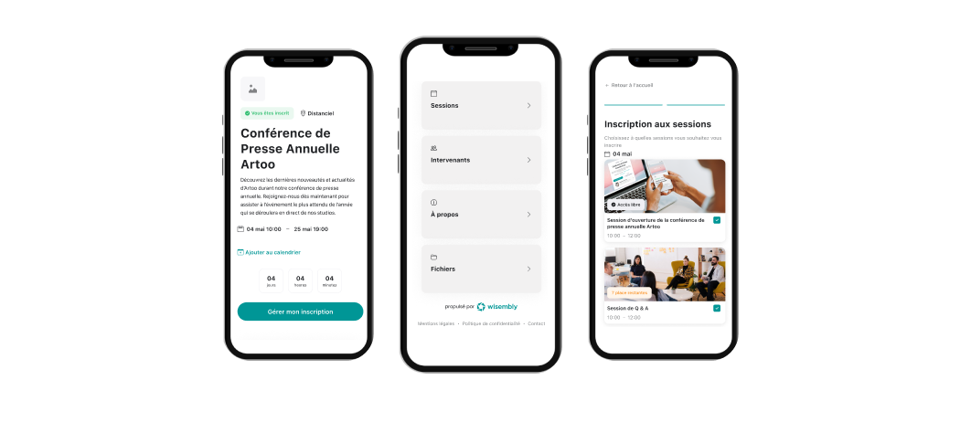
The anatomy of a well-optimized event registration page.
Checklist: 7 things to check before you hit publish
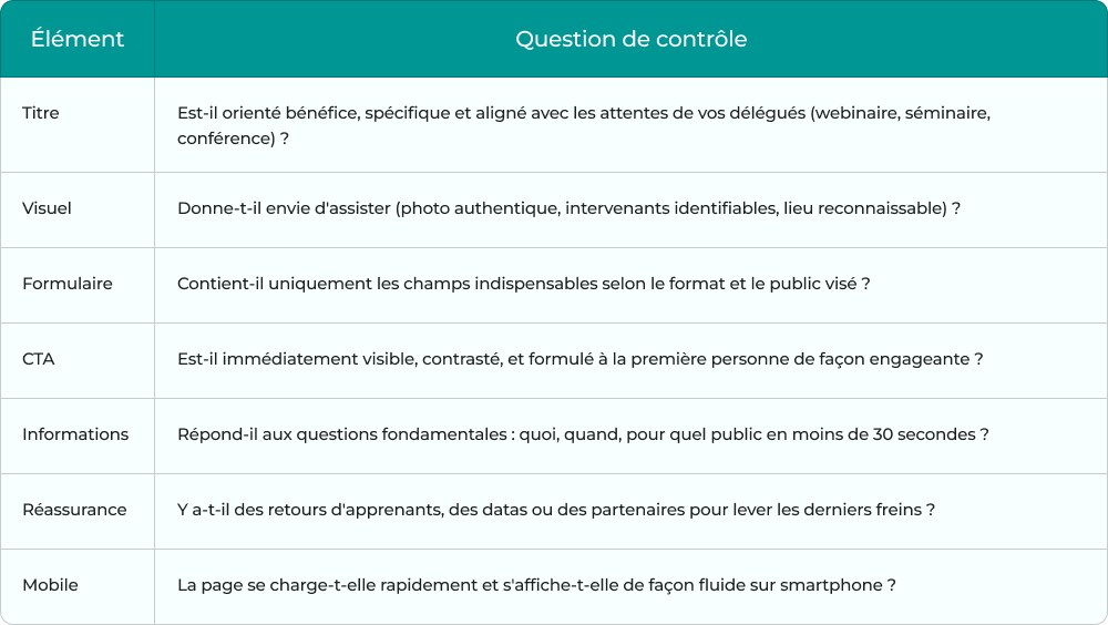
A high-performing event conversion page is built on a tool designed for events, not a generic form builder, and not a patchwork of disconnected tools that don’t talk to each other.
Wisembly lets you build fully customized event registration pages with an intuitive visual builder, adaptive forms tailored to your event type, mobile-first design by default, and real-time conversion tracking. Webinar, seminar, conference, trade show, or training: every format has its own optimized template, 100% customizable to match your brand.